ADA Exit Maps
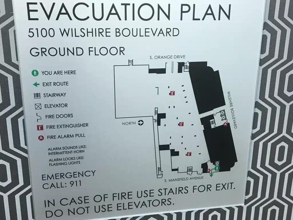
We know that ADA compliant exit maps aren’t just safety tools they’re lifelines that guide everyone out of a building during emergencies.
ADA standards require that these maps have high contrast visuals, clear sans serif fonts, non glare finishes, and proper sizing so they’re easy to read even under pressure. While the maps themselves don’t need tactile lettering or braille, visual clarity is essential: fonts must be large enough for legibility (1″ per 10 feet of viewing distance), and all graphics should be designed to be easily understood by folks with low vision. Mounted on walls at clear floor levels typically between 48″ and 60″ these maps provide essential pathfinding info, helping individuals of all abilities to identify exits and navigate accessible routes quickly and confidently.
But we also understand that in an emergency, clarity matters most and ambiguity can cost time and confidence. That’s why our ADA exit maps are designed with intuitive layouts: simple arrowed paths, well labeled “You Are Here” markings, and color contrast legends that remain visible in low light or stress filled situations. We make sure each map aligns with ADA visual criteria contrasting colors, clear spacing, and matte finish to reduce glare and enhance readability. Whether it’s in a school, office, hospital, or community center, our goal is to create exit signage that not only meets compliance, but actually serves people when it matters most so every individual can feel safe, prepared, and assured in any situation.
Reviews
There are no reviews yet.